Brand Identity
{kind=image}
Throughout the decades, the Studio Museum’s graphic identity has evolved and responded to the times using print and digital media to advance narratives about Black culture and support an ecosystem of artists and art workers. This marriage of cultural specificity and dedication to creating space forever changed the landscape of the art world.
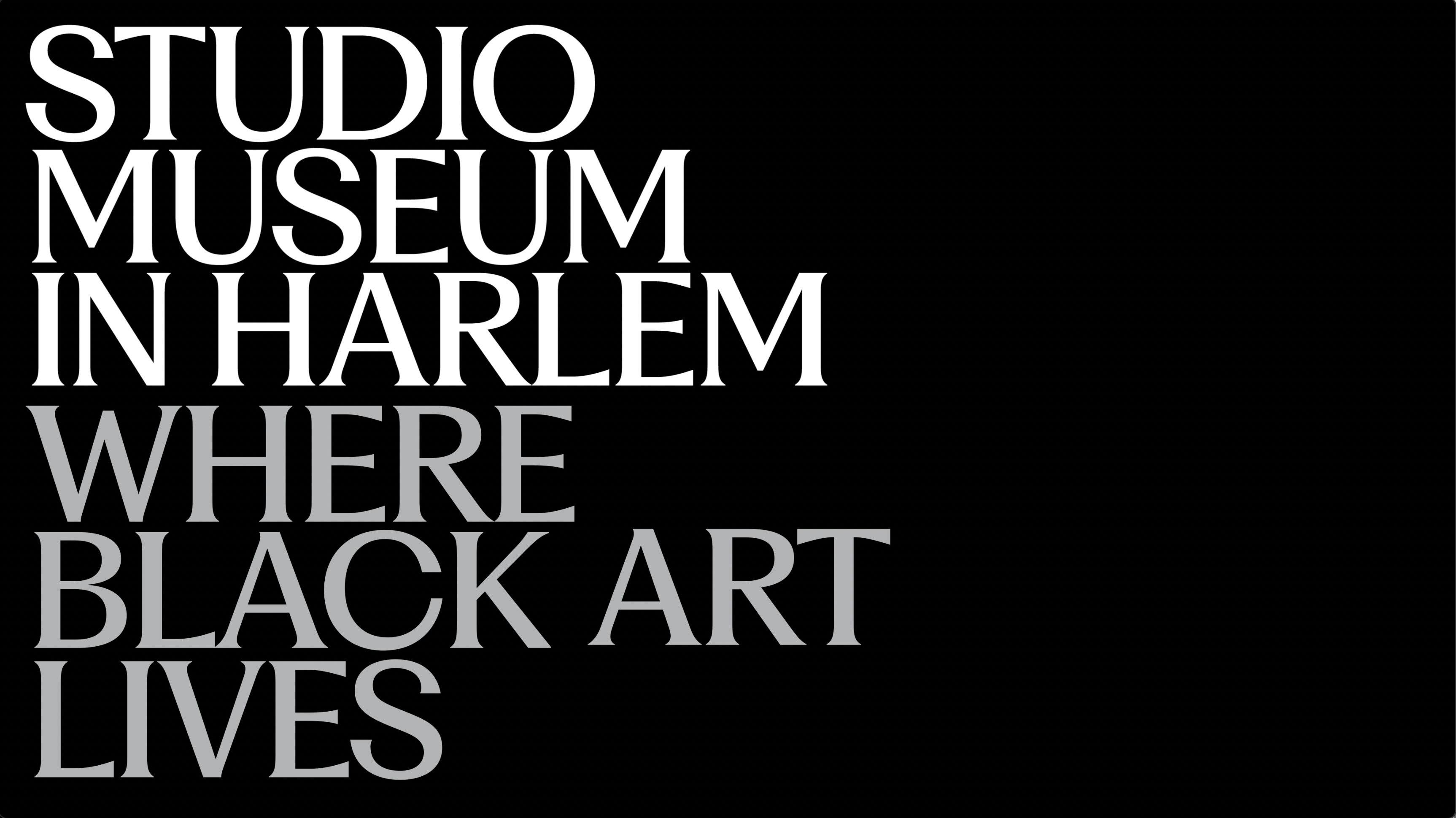
The new identity forefronts typography and a three-tiered color palette favoring black and grayscale that offers a range of creative options for the Museum to deepen its connection to artists, members, visitors, and Harlem.
The Museum’s updated logotype features its new custom typeface, eponymously and reverentially named “Studio Museum Black.” A refined and timeless type design, Studio Museum Black was chosen for its elegant yet utilitarian nature. The new logo stands upright, making it easy to adapt and scale across print and digital formats. The visual stacking of the words pays homage to Harlem architecture with the tiers forming what resembles a stoop—an iconic feature of the neighborhood and a reference to a design element of the Museum’s new building.
The Museum selected 100% black as its primary color. A secondary grayscale color palette that extends the dialogue of representation beyond the binary of black and white, allowing for myriad high-contrast pairings and subtle combinations with black. The tertiary palette draws from artwork for additional color—reinforcing the limitless possibilities of Black art.